|
|
")
|

Design
This section uses different interactive elements of the CourseBuilder platform to demonstrate examples of good and bad design. Students are challenged to use visual elements that enhance and support their message, rather than distract from it.
Examples of different interactive elements are displayed below:
Background
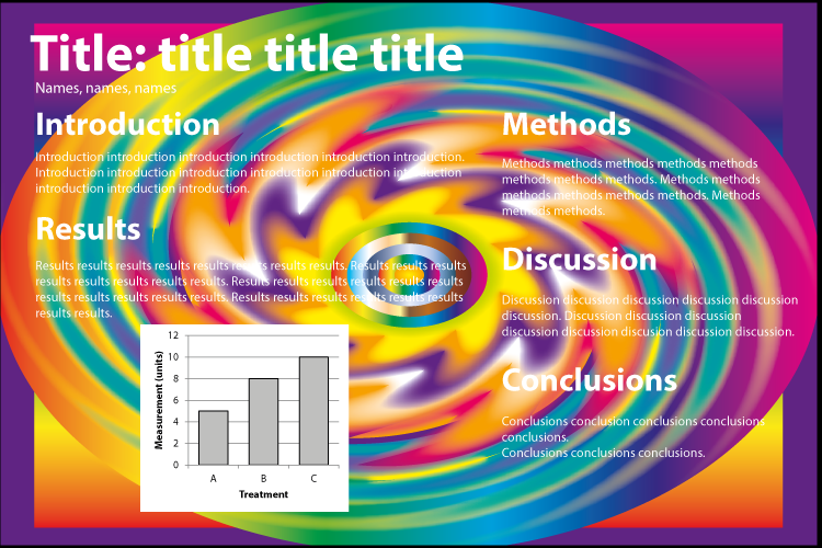
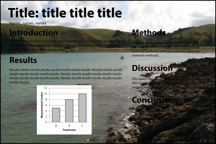
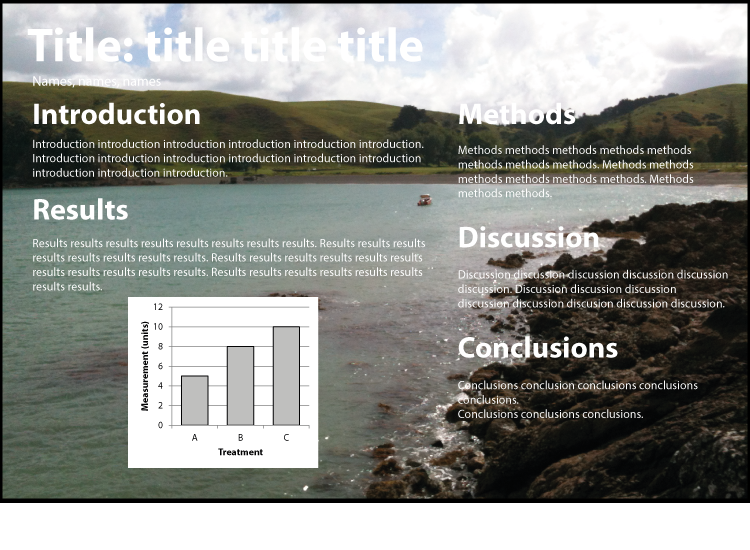
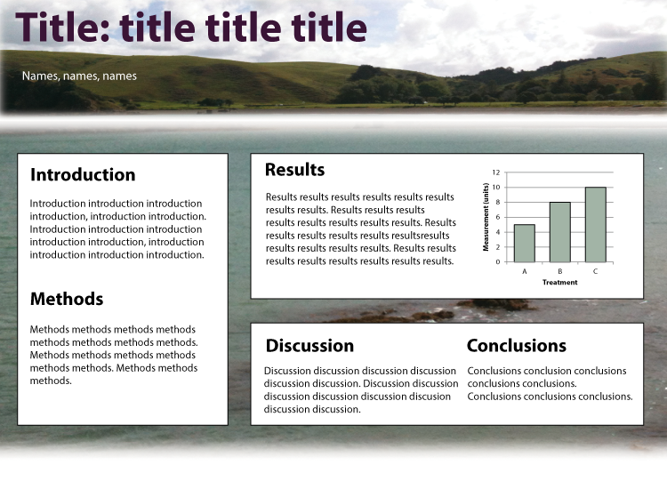
Avoid using backgrounds that distract your audience from your content or make the text difficult to read. It can be tempting to use photos as backgrounds. However, they can make it difficult to navigate the poster content. Think about whether your photo could be better used as a smaller, higher resolution image on your poster rather than a pixelated background. Photos can also have light and dark patches, which can make it difficult to have a consistent text colour that can be read easily across the whole poster.
The images below give you some examples of poor choices of background and some alternatives.
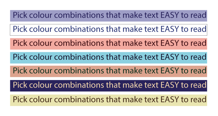
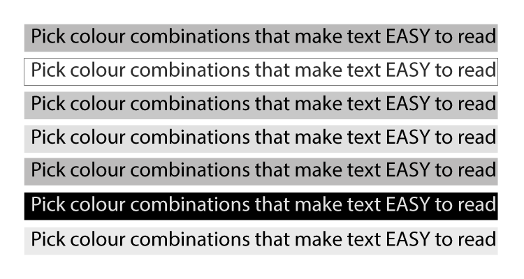
Contrast
Use contrast to make your poster stand out, but avoid colour combinations that make text difficult to read or are hard to look at. To check the contrast of your poster, convert it to grayscale.
Roll the mouse over the text to check the contrast.
|
Colour
The colour wheel below shows examples of different colour combinations that can work well together. There are also websites where you can explore different colour combinations.
Pick a colour scheme and use it throughout to create a cohesive poster. Too many colours can be overwhelming, so limit the number of different colours on your poster.
Colour can be used to highlight important information. Complementary colours (eg, red and green) might be too harsh for your overall colour scheme, but could be used to draw attention to important information.
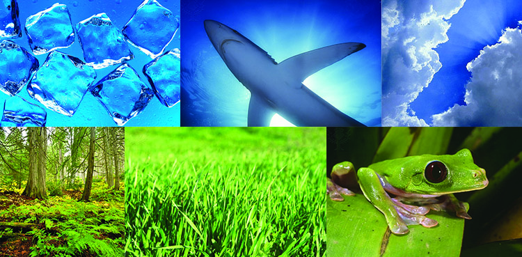
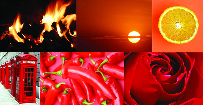
Is there a colour associated with the topic of your poster? For example, a poster about the environment might use a green colour scheme or a research project about water might use the colour blue. Colours also create different moods. Blues and greens are cold colours, whereas oranges and reds create a sense of warmth.
Hover over the words Warm and Cold below to see images related to these colours.
|
|