|
|
Ecology Writing Guide |
|
|
")
|

Example figures
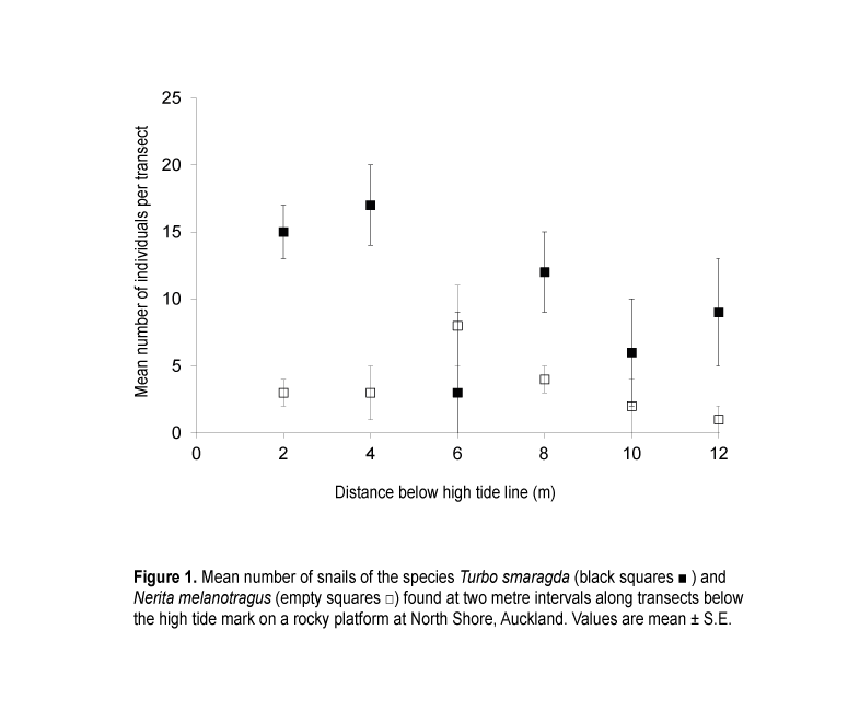
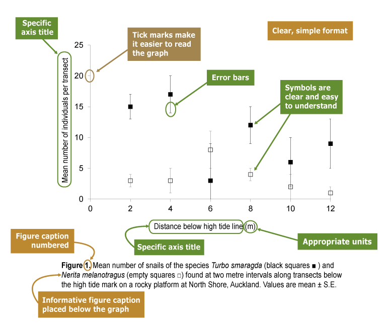
Professional-looking graph
The graph below has a clear, simple format and is easier to understand. The figure caption and labels are informative and include appropriate units. Move the slider to reveal further comments about what makes this a well-presented figure.
|
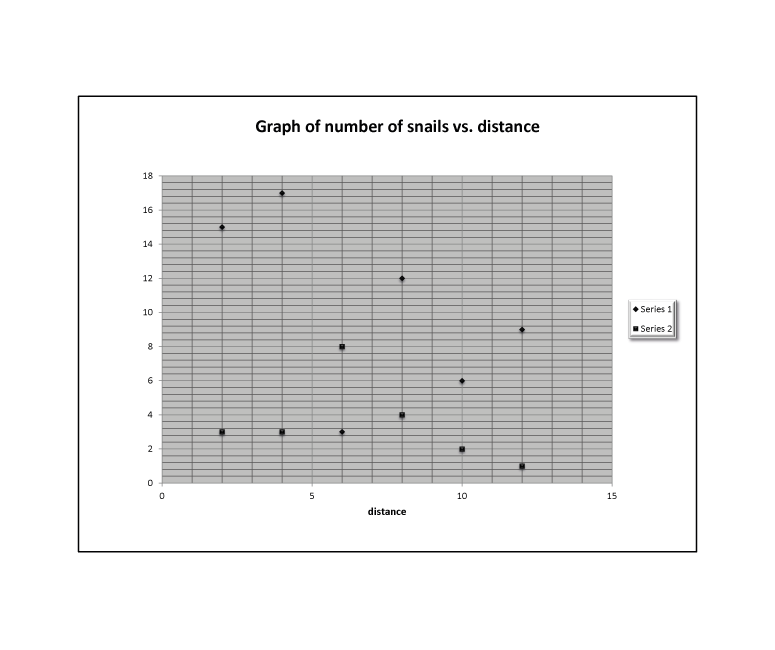
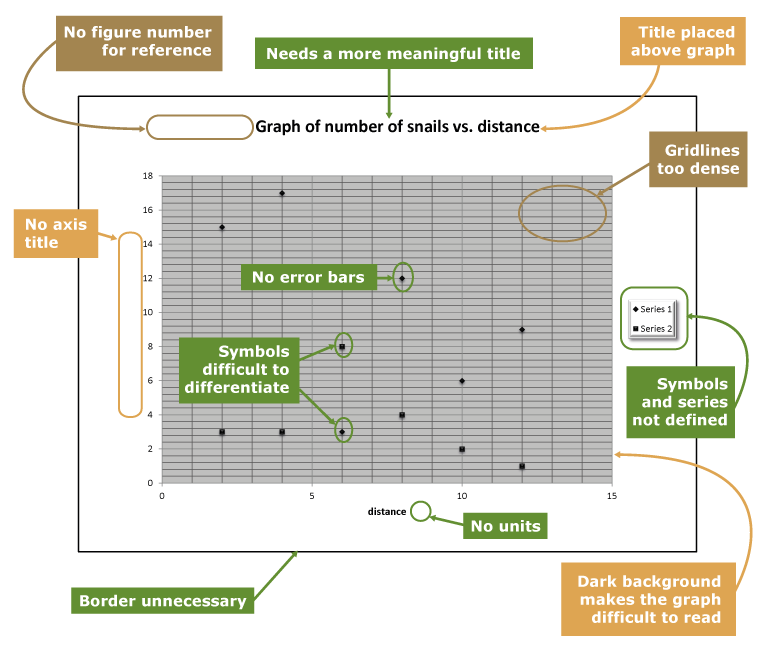
Poor presentation of data
The formatting of the graph below makes it difficult to understand the trends in the data. A lack of specific titles and appropriate units makes the data meaningless. Move the slider to see further comments about how this graph could be improved.
|

